ABBA Type Study
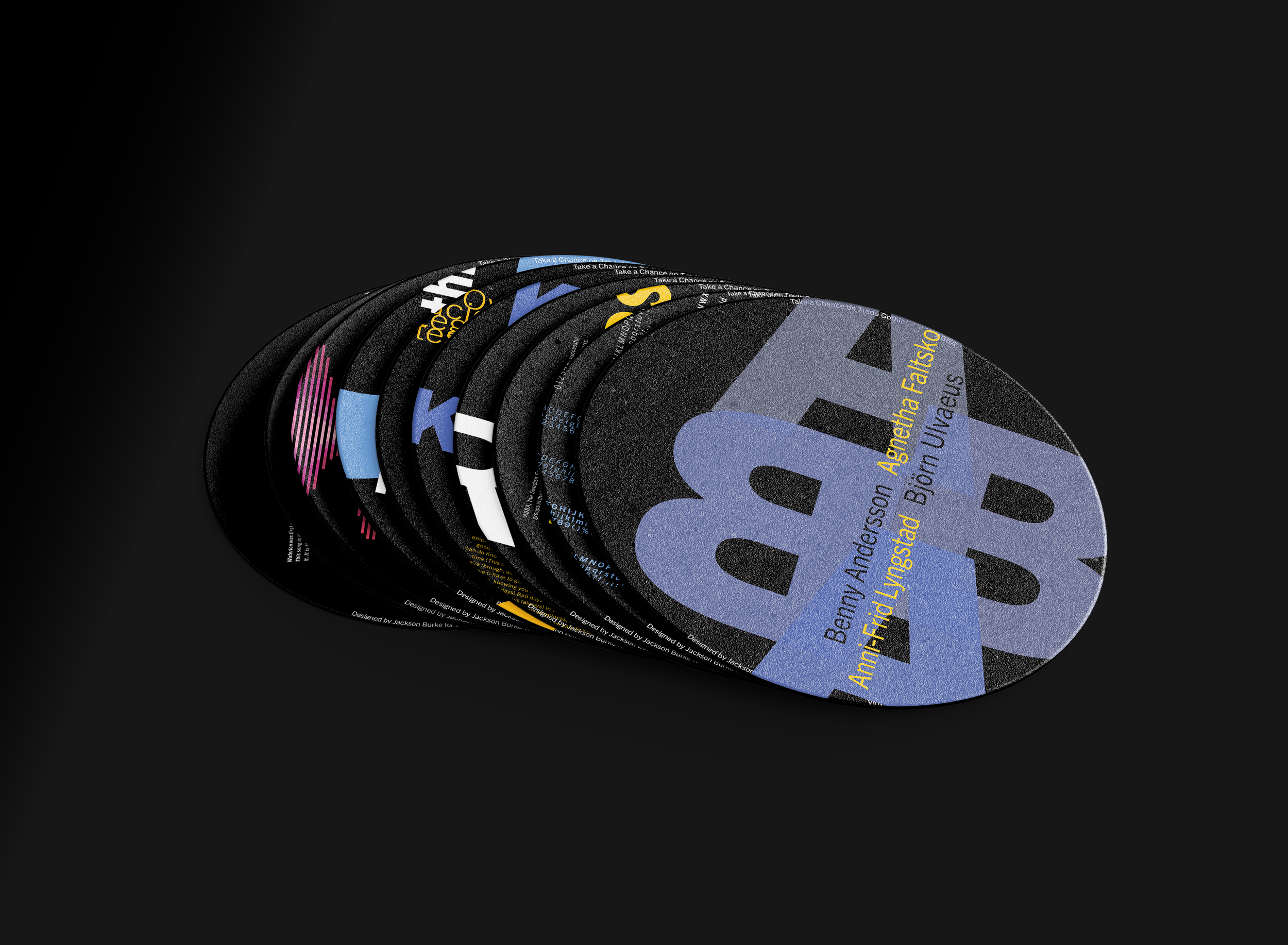
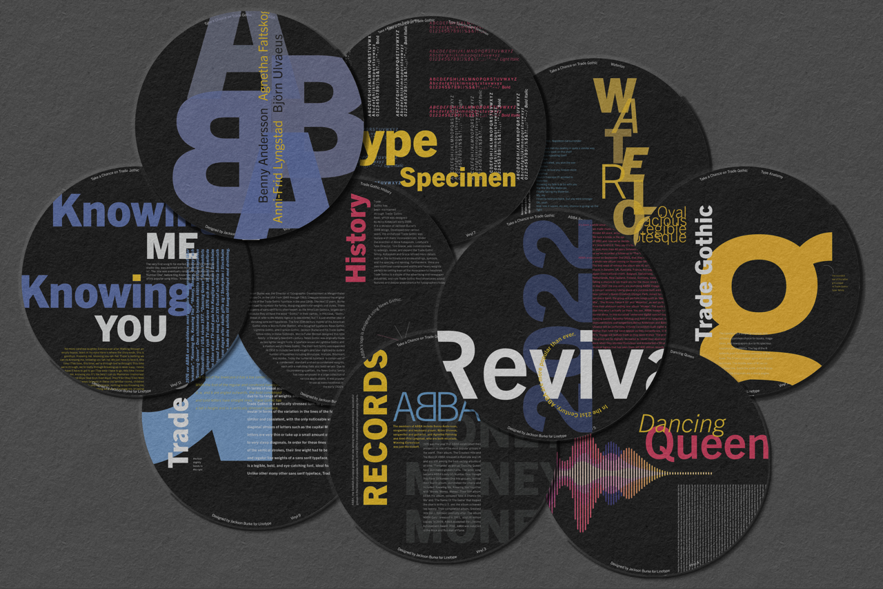
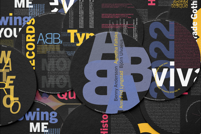
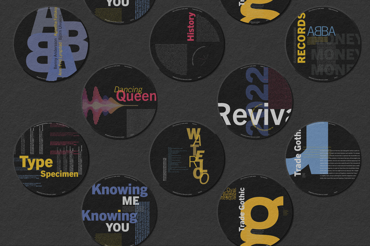
This project explores typographic hierarchy and composition through a study of the band, ABBA, using Trade Gothic. Variations of Trade Gothic appear throughout ABBA’s visual history, including their logo and album covers, making the typeface the conceptual foundation for the work.
Rather than producing traditional flat cards, the compositions were translated into a series of coasters, referencing vinyl cds. The circular format introduced a structural constraint that required type to wrap, rotate, and scale dynamically while maintaining clarity and balance.
The project examines rhythm, scale, and controlled disruption of grid systems, demonstrating how typography can extend beyond rectangular formats while remaining functional, communicative, and structurally cohesive.